
2026-09-22 · 7 min read
Plated Label, Sculpted Cap: The Metalwork on a 0.4 m Flocked Factice
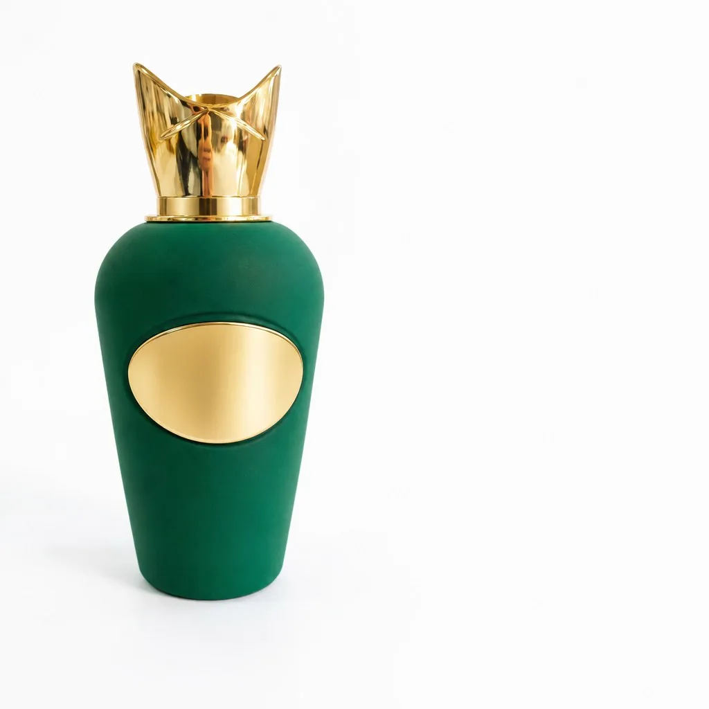
People ask us about the flock first, and that is fair: a velvet finish is the thing that stops someone in front of a window. But the parts that make a factice read as expensive rather than just soft are the metal bits — the label on the front and the cap on top. They catch the light while the flock swallows it. Get them right and the piece looks like it came off a boutique shelf; do them cheap and the whole model falls flat no matter how good the flock is. This is about those two parts on a 0.4 m flocked factice, and how we build them.
The body stays soft; the metal does the talking
We have written the flocking process up separately — how a one-piece fiberglass shell is prepared, sealed and finished with an electrostatic velvet pile, then checked under raking light for thin patches. Read that if you want the fullwalkthrough of a 0.4 m flocked factice. For this piece the important thing is the pairing. Flock is matte and light-absorbing; gold plate is glossy and reflective. One reads as fabric, the other as jewellery. The design only works because of that contrast. Take the shine off the label and the bottle turns into a velvet silhouette with no focal point.
Why the label is plated, not printed
A "gold-plated label" is not a gold-coloured sticker. Plating means an actual layer of metal is deposited onto a substrate — in our case a resin or zinc alloy blank cast to the label's shape — so the surface behaves like metal: it reflects, it ages slowly, and it does not rub off the way foil or print does. The blank is polished first, because plating copies whatever is underneath it. A rough cast under the gold shows through as a dull patch no amount of plating will hide.
The relief on the label — the border, any raised lettering or crest — is cast into the blank before plating, not printed on afterwards. That is the difference you can feel in a shop: run a finger over a printed logo and it is flat; run it over a cast, plated one and the edges rise. Buyers notice this even when they cannot name it. It is the single most common reason we are asked to redo a competitor's piece.
Sculpting the cap
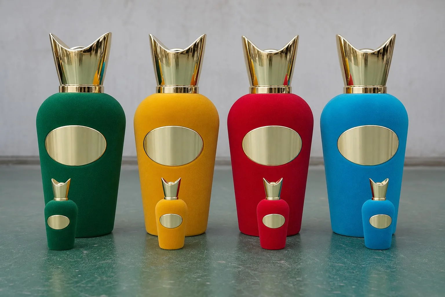
The cap is the first thing a person's eye lands on, because it sits highest and it is almost always the most decorated part of the bottle. A sculpted cap — one with real three- dimensional form rather than a simple turned shape — starts as a master. We model the form, make a mould, and cast it in resin, then finish it by hand before plating so the detail survives. The hand work is where the hours go: a crown with facets, a crest, any undercut that catches dust, every one of them has to be cleaned, primed and checked before it sees gold.
The cap is cast and plated on its own, never with the label. They are two separate parts made by two routes, and the only thing they share is the plating bath. That separation is what lets us control each detail independently — and it is also where things go wrong if you are not careful, which brings us to the colour.
Matching the two golds
"Gold" is not one colour. There is bright gold, champagne gold, antique gold, and each of them shifts again depending on the plating bath, the voltage and how long the part sits in it. If the label and the cap are plated in separate runs without a reference, you end up with two slightly different golds on the same bottle — not something most people can name, but something they see. So we plate both against one approved sample and check them side by side under the lighting the piece will actually sit in. Shop spots are merciless on gold: a mismatch you cannot see on a bench shows up under them in seconds.
What we leave blank
The label itself ships blank unless you are the owner of the mark that goes on it, or can show you are authorised to reproduce it. That is a policy, not a refusal: most of the factices we build are for the brands themselves, and plenty of others are for agencies working on their behalf. If you send us a bottle with a mark you do not own, we will tell you at quoting rather than quietly copy it. A blank gold label is also simply more useful in a shoot — the prop belongs to the campaign, not to a logo.
Specs at a glance
| Height | 0.4 m shown; built to your size |
|---|---|
| Body | Fiberglass, velvet-flocked finish |
| Label | Cast blank, gold-plated; relief detail cast in, shipped blank by default |
| Cap | 3D sculpted resin, hand-finished and gold-plated, made as a separate component |
| Colour match | Label and cap plated against one approved sample |
| Minimum order | from 1 piece |
| Sampling | around 15 days for the first piece |
Common questions
Can the label carry our own logo?
Yes, where you own or are authorised to use the mark. Send the artwork and we will cast the relief and plate it to match the cap. Where rights are unclear we will ask for confirmation before we quote.
Is the gold real plating or paint?
It is electroplating — a genuine metal layer over a cast substrate, not gold-coloured paint or foil. That is why it reads as metal under spotlights and why it does not rub off in handling.
Will the label and cap match each other?
Yes. Both are plated against one approved sample and checked side by side under shop lighting before the piece ships. If your design uses two finishes on purpose — say antique gold on the cap and bright gold on the label — we do that deliberately, not by accident.
Can I order just the cap, or a replacement part?
In most cases yes. Because the cap is a separate component we can re-make a single cap rather than rebuild the bottle, which is worth knowing if a piece takes a knock in transit.
The flock gets people to stop; the metal is what makes them believe the bottle is worth something. If you have a design that deserves both treatments, send us the bottle or drawing and we will come back with feasibility, a plated sample and a quote. New to the category? Start withwhat a factice bottle is, or see the full range of factice perfume bottle models we build.